
Ребрендинг существующего художественного театра в связи со сменой художественного руководителя, необходимо донести новые ценности театра: прогрессивность, смелость, готовность к экспериментам и постановке действий, где зритель проходит трансформационный путь.Ребрендинг существующего художественного театра в связи со сменой художественного руководителя, необходимо донести новые ценности театра: прогрессивность, смелость, готовность к экспериментам и постановке действий, где зритель проходит трансформационный путь.
Rebranding of the existing art theater in connection with the change of artistic director, it is necessary to convey the new values of the theater: progressiveness, courage, willingness to experiment and stage actions, where the viewer goes through a transformational path.

В советское время в здании театра был кинотеатр, с названием «Прогресс». Это был районный центр, где любили отдыхать местные жители. Когда перед ребрендингом встал вопрос о названии театра, было проведено исследование у местных жителей. Оказалось, что местные жителя района вспоминали прошлую историю кинотеатра с особым теплом. Название оказалось очень близким для основного сегмента аудитории 40+, и в то же время кажется современным и понятным для молодежи, так как сейчас есть тенденция на кириллические понятные названия с ноткой советской эпохи.
In Soviet times, there was a cinema in the theater building, with the name "Progress". It was a district center where the locals liked to relax. When the question of the name of the theater arose before the rebranding, a study was conducted with local residents. It turned out that local residents of the area recalled the past history of the cinema with special warmth. The name turned out to be very close to the main segment of the 40+ audience, and at the same time it seems modern and understandable for young people, as now there is a trend towards understandable Cyrillic names with a touch of the Soviet era.


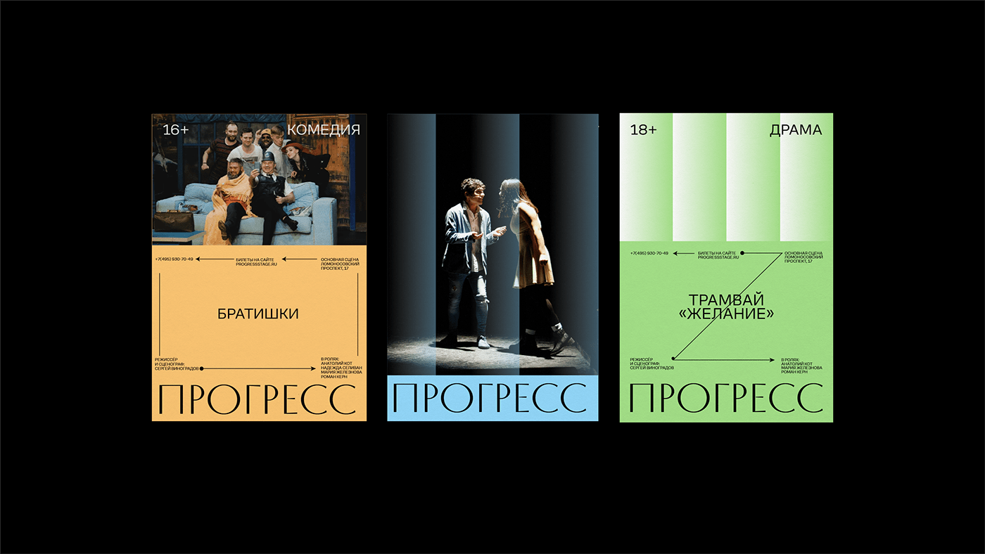

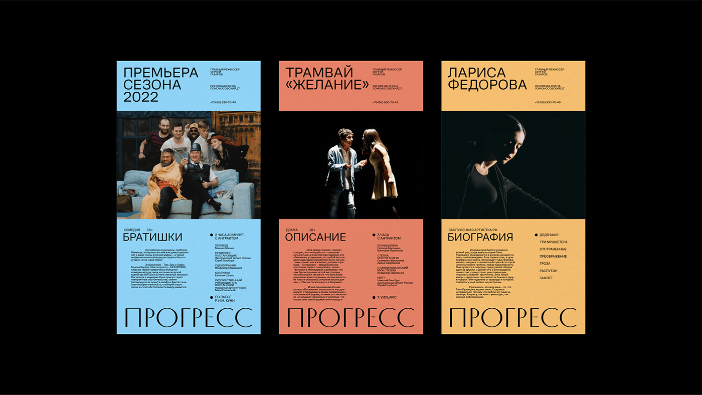
Так как для театра было принято решение вернуть название прошлых лет, графика была разработана для поддержки ностальгических настроений, но в то же время с современными свежими цветами, и техническими деталями. Прогресс – это про технологичность и движение вперед, но также прогресс невозможен без участия человека и его искренних намерений изменить мир к лучшему. Поэтому графика сочетает в себе техническую эстетику в сочетании с теплыми градиентами, вдохновленными металлическими текстурами советских плакатов.
Since the decision was made for the theater to bring back the name of yesteryear, the graphics were designed to maintain a nostalgic feel, but at the same time with modern fresh colors and technical details. Progress is about manufacturability and moving forward, but progress is also impossible without the participation of a person and his sincere intentions to change the world for the better. Therefore, the graphics combine a technical aesthetic combined with warm gradients inspired by the metallic textures of Soviet posters.

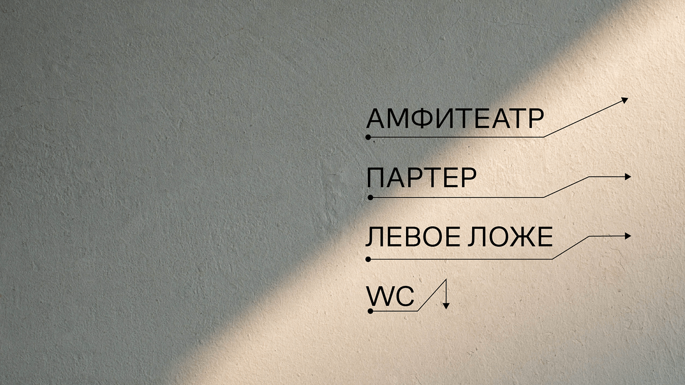
Визуальное решение построение на принципе повторяющихся элементов: градиентов, изображений, сеток. Прогресс достигается в следствие проб и ошибок, повторяющихся действий, которые приводят к результату. Ритмический повтор передает ощущение движения вперед и достижения целей.
Visual solution building on the principle of repeating elements: gradients, images, grids. Progress is achieved through trial and error, repeated actions that lead to results. Rhythmic repetition conveys the feeling of moving forward and achieving goals.


Design: Vika Lamina
Typefaces: CoFo Sans by Contrast Foundry, Ricordi Allegria by TypeType
Design Studio: Ovsyanka


